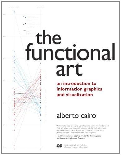
Unlike any time before in our lives, we have access to vast amounts of free information. With the right tools, we can start to make sense of all this data to see patterns and trends that would otherwise be invisible to us. By transforming numbers into graphical shapes, we allow readers to understand the stories those numbers hide. In this practical introduction to understanding and using information graphics, you’ll learn how to use data visualizations as tools to see beyond lists of numbers and variables and achieve new insights into the complex world around us. Regardless of the kind of data you’re working with–business, science, politics, sports, or even your own personal finances–this book will show you how to use statistical charts, maps, and explanation diagrams to spot the stories in the data and learn new things from it.
You’ll also get to peek into the creative process of some of the world’s most talented designers and visual journalists, including Conde Nast Traveler’s John Grimwade, National Geographic Magazine’s Fernando Baptista, The New York Times’ Steve Duenes, The Washington Post’s Hannah Fairfield, Hans Rosling of the Gapminder Foundation, Stanford’s Geoff McGhee, and European superstars Moritz Stefaner, Jan Willem Tulp, Stefanie Posavec, and Gregor Aisch. The book also includes a DVD-ROM containing over 90 minutes of video lessons that expand on core concepts explained within the book and includes even more inspirational information graphics from the world’s leading designers. Это и многое другое вы найдете в книге The Functional Art: An introduction to information graphics and visualization
